Updated Sling TV UI rolls to Roku

Attention Roku users: your Sling TV user interface (UI) is about to get a major facelift! Our new UI makes the Sling TV experience more personalized, which means getting to the programs you love is easier than ever before. The new UI will be live on Roku players and TVs starting today.
Below are some of the biggest updates you will soon find in the new Sling TV UI on Roku:
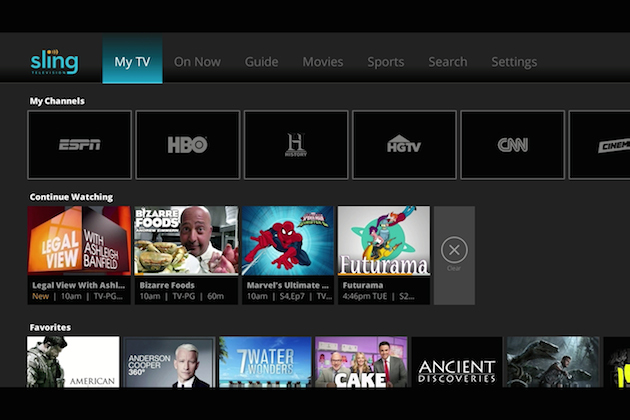
My TV – My TV is your new home screen. From this view, you can select your favorite networks to populate “My Channels” in the top ribbon for one-click access to the channels you watch most, You’ll also be able to pick up a show right where you left off with the “Continue Watching” ribbon, and within the “Favorites” ribbon, you can add your most-watched shows, series and movies.

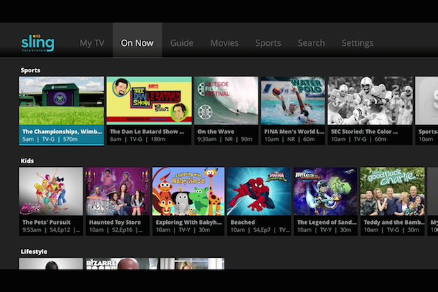
On Now – The On Now view is curated based on what’s currently airing and is organized by categories like sports, lifestyle and action, for easy navigation. This means you can navigate live content by genre instead of scrolling channel by channel.

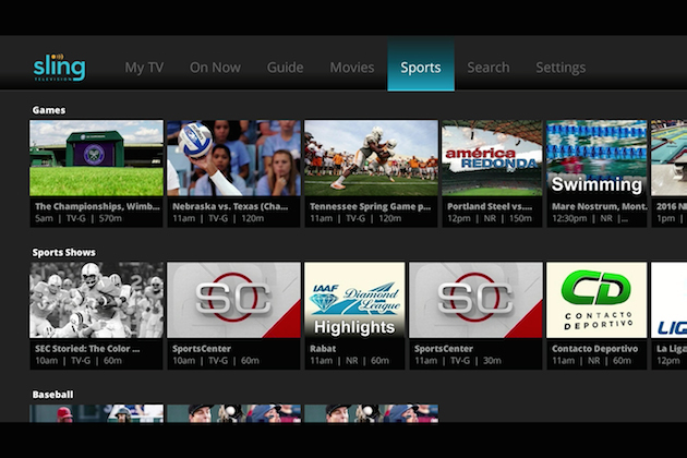
Sports (coming soon) – Whether you want to watch baseball, basketball, lacrosse, football, hockey, soccer or cricket, you will be able to view programs by sport, schedule or what’s on now.

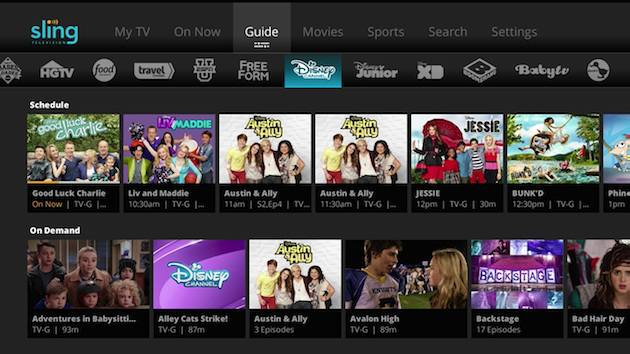
Aside from these changes, we kept some of your favorite features, like the Guide, where you can find all of your live and on-demand content in one place. Currently, the new UI is live on Apple TV and will be rolling out to the rest of our Sling TV-supported devices throughout the year.
To share a suggestion about the new UI on Roku players, email us at rokufeedback@sling.com. To learn more about the new Sling TV UI on Roku, customers can visit help.sling.com.
To keep up with the latest announcements, bookmark this blog, like us on Facebook, or follow us on Twitter (@Sling)!
Sling TV Staff
#TakeBackTV
