The UI Gets Personal With New “MY TV” View
One thing is for sure, our viewers love Sling TV’s content. But because we nearly doubled the number of channels in the “Best of Live TV” package since launch and have more than 10,000 hours of on-demand and look-back content, the original Sling TV user experience became a little cumbersome. We knew something had to change.
So we launched phase one of the new user interface (UI) a few months ago, giving all Sling TV subscribers access to the new full guide on every device. As I mentioned when we started rolling out the first update, we knew this was only the beginning.
And I’m here today with an update. We just unveiled what the new UI will look like. Our phased roll-out begins later this quarter. One of my favorite “views” in the new interface is called “My TV.”
Introducing My TV
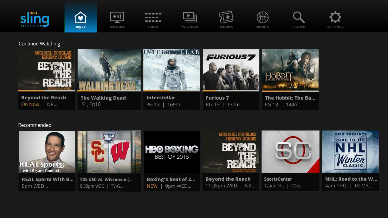
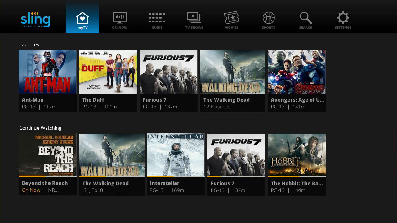
The My TV view brings the viewer’s favorite content directly to them, rather than requiring them to seek it out. In our minds, if we designed My TV right, the viewer will always find something there to watch.

Why do we say this? Here are four reasons:
1. Favorites – My TV pulls the viewer’s favorite content into a singular view, and filters it in a number of ways. The filtering is primarily an automated process and learns viewers’ preferences over time. For example, the first ribbon highlights all of the “favorites,” including both channels and shows that the viewer told us they love and those we automatically ‘know’ are the favorites. We developed this feature because many of your requests asked us for a way to instantly get to your most watched content. The new “Favorites” ribbon is our response to those requests.
2. Continue Watching – Historically, it’s been challenging for Sling TV subscribers to easily resume shows and on-demand content they had previously paused. That’s not going to be the case anymore with the new UI update. All of your paused content should be found in the “Continue Watching” ribbon under My TV. This is huge for me! Starting and ending a movie in my house is very hard to do in one sitting. It usually takes us at least two attempts. So, having the ability to pick-up where I left off is going to un-complicate things quite a bit for my family.

3. Recommendations – I’ve heard from a lot of you that you weren’t aware of all the great content we have available because navigating through it on Sling TV can be tiresome. So we want to make that easier for you. In future launch phases, our new recommendation engine in the My TV view will recommend shows, movies and even sporting events for you to watch based on your viewing habits. Your Sling TV app will learn over time what you do and don’t like, and no action is required on your part. Just sit back, relax and let us do the work for you.
4. What’s Hot – Over the last year, we also learned that our viewers love social media and want to stay in-the-know. We took this insight and plan to launch a “What’s Hot” filter ribbon in the My TV view in a later phase of the rollout. Is there breaking news on the other side of the world? We might include all news channels in this view to get you up to speed faster. Is there a season finale about to air that people won’t stop teasing spoil alerts? Let us add that in for you. No more searching to find the must-see content.
These are just a few of my favorite things that will launch with the new UI later this quarter. For a full list of features that we plan to unveil, check out this blog or watch a demo video to see these updates in action.
I enjoy chatting with all of you on Twitter, so please keep the comments coming. We are listening and will continue to evolve the user interface as we learn more about our audience’s behaviors and preferences. Send me your comments on Twitter at @BenSlingTV, or reach out to our customers care team at @SlingAnswers or feedback@sling.com.
For more of the latest updates from Sling TV, bookmark this blog, like us on Facebook or follow us on Twitter (@Sling)!
Ben Weinberger
Chief Product Officer, Sling TV
#TakeBackTV
@BenSlingTV
